Our Poster Inspirations

What we like here in this poster is the use of both the protagonist and the antagonist as it gives out a bit of fear as she is unaware of the antagonist behind her. What we also like in this is the heavy use of red with mixtures of orange to clearly emphases danger and excitement. This could clearly be related to visceral pleasure as the audience might be appealed to this film because of the violence and danger. We also like the silhouette of the antagonist so it limits the detail of him. Looking at this, we too decided that we wanted our antagonist in the poster, that we present him in a silhouette as it limits detail which then keeps the audience in suspense as to who is the antagonist and why he is the antagonist.
In addition, we also liked the use of typography they used as it does relate to the theme of the movie. Having the word "Nightmare" in a larger size in contrast to the other words makes this relate to the positioning of the characters in two ways. One way is that the nightmare is the antagonist who is seen to possess more dominance in the film. And also the use of the font helps present the film as being a supernatural film as he isn't a being he is a ghost but still impacts the living through dreams. This can be related back to the tagline which says, "he knows where you sleep." |

We was really appealed to the use of makeup on the Antagonist's face as it did clearly shows a horror film which is unconventional as clowns are usually entertaining their audience rather than killing them. However, this film does act on their audiences fears of clowns which does make it successful in this poster as his eye is placed in the positioning of the top right third line. This is important for us too, as my audience are more appealed to parts within the rule of thirds rule than having everything placed in random parts across the poster.
In addition, we liked the colour scheme as it does present this film as a splatter film due to the heavy use of red which is displayed on top of the white. I believe this is effective as it makes the audience think that it is a splatter film when it is really a supernatural film. However, as a group we do not want to present our antagonist as we believe it will give away too much detail about the appearance of our antagonist which may also start to ruin our audience's intellectual pleasure as they would want to figure it out themselves. |

This poster uses the effect of having the image placed inside the title which we thought was highly appealing and we wanted to try and adopt this. This is because the title denotes the name of the film but it also connotes the meaning of the word as the "thing" they are focusing in on is the figure in a heavy snow-jacket. Already, the colour scheme is clearly white and black which conveys the person as being lonely due to the limited use of white in the poster. In addition, the use of the tag line also denotes the sub genre of this as being a monster as it clearly pauses in the sentence, " Not Human.Yet." This would automatically tell the audience that it is something similar to a zombie film. But, as a group, we like the idea of adopting a tag line to help present what our sub-genre would be as well as giving our audience a bit of a scare and also make them think about what the tag line could mean (denote).
|

We as a group again were automatically draw to the use of a close-up with the effect of low-key lighting being used to keep the antagonist in the dark. We believe this is highly effective towards our audience as the antagonist clearly appears to be lurking in the background which creates a tension mood for the audience. This is mainly due to the red eyes which were either contacts or made over photoshop and mask which covers the full identity of the antagonist which would again appeal to the audience as it makes them question this, acting on their intellectual pleasure. Again as a group we like this idea because it keeps our audience drawn to this which would make them think about the possible synopsis and storyline of this film which may cause them to want to watch this film.
Furthermore, the use of a tagline being placed in an unconventional position helps emphases on it's meaning. We like this as we wouldn't want to use conventional layouts as our audience might start to be bored with seeing the same old layouts. |
Our Magazine Inspirations
For our magazine inspirations, we did look at horror genre magazines however the layout and visual representation of some of them didn't really appeal to us. This was mainly because they had the same conventional colour scheme to try and scare their audience. We though that this was unsuccessful as it looks like the magazines are trying too hard to scare their audience. We believe for a magazine, we should use the conventional layout to help present our film at a higher standard.

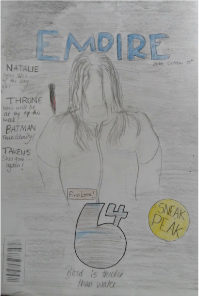
The colour scheme which is predominantly black and red conveys a dangerous mood which as a group we would want in our magazine. We would want our audience to have some knowledge of our film which was used by the main cover line and with the dominant image in this magazine which we want to try and adopt as well. We would want them to have some limited knowledge as to who is the protagonist is and a bit about the antagonist as we want to keep the antagonist a secret. This would therefore support this magazine as it does use the protagonist as the model for the dominant image which makes the audience generate possible antagonists based on the title of the film and the main cover line used. We also liked the idea of the masthead being made to relate to the film which Empire did in this magazine. The use of fire relates back to the hell boy franchise however, we could adopt this and have something distributing the masthead like a knife which is relating it to our film as a knife is the antagonists weapon.
In addition, we also like the use of the puffs being used to draw in our audience. Empire used this here but if we were to adopt this, we would need to design it so that it stands out from the rest of the magazine but also upholds the horror genre. This is because we would still want our audience to recognise our film as a horror slasher film and not as a thriller. |

The dominant image here is presented in a long shot to clearly present what the antagonist is wearing. We as the audience can tell he is the antagonist due to the makeup used on his face followed by the smirk and odd clothing used. We as a group then discussed that this is effective as this magazine doesn't need to say that he is but is recognizable that he is the antagonist due to the mise-en-scene used. We would therefore want to adopt this by presenting our model who is the protagonist with the right clothing as well as lightly applying make up to show that they went through a lot of drama and problems. We however disagree with the use of the antagonist being used as we want to keep ours mysterious which is different for this magazine as this character is recognizable through other medias such as films, games and comics.
|

We do like the idea of having red heavily in our magazine however, we do not like the layout of each element. We believe the the coverlines distract the audience too much as they are also given their own third. Having them placed across the whole left third limits the space of the dominant image which doesn't help market their film even though there is a main coverline of the title of the film. In addition to this, modern society are used to seeing magazines with digital dominant images which wasn't shown here. This was different which was appealing to us as we could adopt this but at the same time, our audience are drawn to higher quality images in contrast to drawn poster.
|

Despite being plain, we liked the idea of having two elements in the magazine. These elements are the Masthead - Dazed, and the main cover line - The new Amandla; which is broken up and placed across the bottom left third and top right third. Placing them here helps draw attention of the audience here which is good as they were purposely placed across the magazine. A reason may be because they want to mimic people discussing the new Amandla which is also the main coverline. We as a group like this but we felt our audience would find this confusing if we did something familiar. This is because if we were to do something familiar we would need the model to appear scared.
|

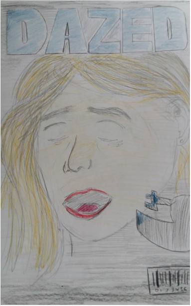
The use of black and white followed by the split page did appeal to us as we liked the way the page was divided along with the personality of the model. Because this was new to us, we were drawn to it heavily which we thought we could adopt. This is also supported by the main cover line which also follows this colour scheme and contradicts the dominant image. We thought of also adopting this as it makes the audience as well as us question this magazine cover which meant that more people were appealed to it. If we tried to do this, it would mean more people who be appealed to our model and the presentation which may cause more people to want to see the film.
Moving on, the limited use of elements also draws our attention to the dominant image which we liked. This is because cover lines distract the audience from the issues main article, so this magazine limits the size, positioning and place these take up in comparison to the dominant image and main cover line. In addition, the use of 4 main elements besides the dominant image helps present more detail on the dominant image. We thought this could be bad for us as we would want to limit the detail and props use so that the audience keeps questioning our model which acts on their intellectual pleasure again and maybe present the model as an erotic object if we used a female model as our protagonist (The final girl based on Carol Clover's Theory). |
Draft Poster
This design was heavily influenced by "the thing" poster as we did like the way the creators incorporated the image inside the text. We felt like that was strong, which was why we have this as one of our drafts. In this design, we used red, black and some white as this is a conventional colour scheme for horror films; as red symbolizes death and danger and black symbolizes darkness and mystery. We also wanted to limit the amount of elements as more elements take up specific parts of the third which causes the dominant image to become more of a background and less of a focus point.
|

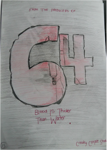
We were influenced by the way Nightmare on Elm Street incorporates the antagonist and protagonist which we tried to do here but because we don't want to show our antagonist, we presented his weapon that he uses to kill his victims with. In here we adopted a Blue, black and white colour scheme with some colour from the cheese for example. We adopted this from paranormal activity who use blue to connote surveillance. This therefore presents our sub-text about Government surveillance.
|
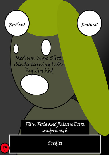
We choice to adopt the final girl in our poster in contrast to the conventional antagonist, so we placed our final girl Cindy so that she appears to be looking back in fear. We want to place her eyes on the top left and top middle third as these areas would be most appealing visually for our audience. We also wanted to have more detail so we used more elements over the page to connote claustrophobia as she is also in a dark surrounding but is tight. Doing this would add fear into our audience which would cause them to watch this as they want to be scared.
|
We adopted the layout of Clown here but wanted to reduce the size and space our protagonist's face takes up as we wanted to introduce the murder weapon which is always given away in other posters. We believe doing this gives our audience the idea of the sub-genre which could be either a slasher or splatter but we done this because our audience is becoming bored with supernatural films which been produced more nowadays.
|
Draft Magazines
We liked the idea of involving our final girl in the magazine, especially because many males are appealed to seeing females in exposing clothes and helpless and also because females also like the idea of seeing their makeup and fashion as well as appearance. Also, we did involve a shadow which is mean to present the antagonist so that the audience understands that the girl is not the antagonist or possessed. We also wanted to adopt the idea Empire had with their masthead which was designed to relate to the film. We thought this was appealing as it wasn't the same old conventional masthead which wouldn't appeal to the audience as much.
|
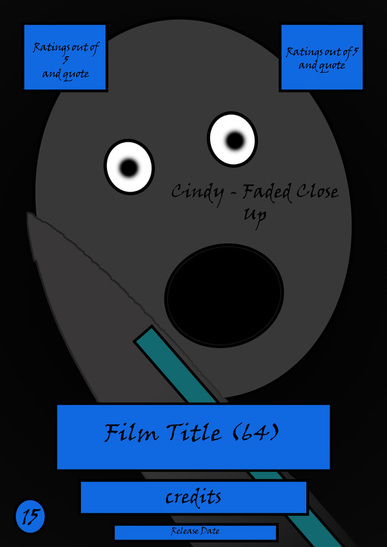
We were inspired by the close up and layout used in the Dazed magazine we looked at. We thought that we could adopt this as a group so it appeals to our audience as they would be able to see the distress and problems she is encountering in the film which may cause them to want to watch it. However, as an improvement we should relocate the title of the film to the center bottom third which is conventional and also causes the magazine to be a poster because of the limited use of elements.
|
We liked the idea of using a medium long shot to show off the protagonist. This helps present the state they are in physically as we could use dirty dresses or tops to denote that she has been running and falling/hiding everywhere. we also liked the idea of using this as it looks like she is afraid of the viewer as she is holding her hands up. This may cause the audience to question what she is scared of, and may even scare them as they may think that someone is behind them.
|
Looking at the Dazed magazine, we were inspired by the use of a split to separate two different personalities. In this magazine, we could use half of our antagonist and another half of our protagonist, but limit the detail on our antagonist by using low-key lighting which may cause him to blend into the black background. We also liked the idea of using cover lines on the right third and also a puff to make our audience see this and then see the contents straight after. This gives us a higher chance of being brought.
|
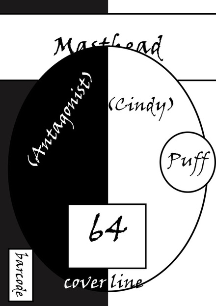
We wanted to develop our previous design so it appears like our protagonist is trying to match the dominance of the antagonist. Doing this also draws more attention as we are allowing the audience to take sides whereas previously they may have been forced to focus only on the antagonist. We also adopted a black and white colour scheme to connote evil versus good which is conventional in many horror films. We also wanted to limit the elements so that the audience is clearly appealed to the dominant image and would have some knowledge as to what is involved in the issue by the use of the puff.
|
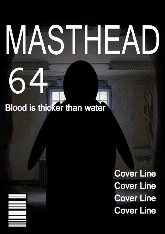
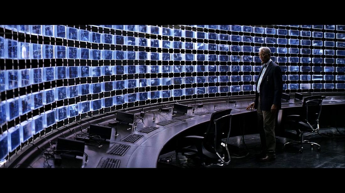
We felt like this is one of our strongest designs. This is because we didn't originally want to include our antagonist however, we presented him in a silhouette. Doing this made him appear as someone in the shadows which is what his character is like in the film. We also liked the idea of separating our elements so they have their own space and that it doesn't make the audience drawn to one specific third as it is balanced. If we were to develop this further, we could a desk with multiple monitors on there to really present the antagonist as a stalker. Something like this below but at a straight view so we get a silhouette instead of a high-key lighting of his appearance which gives away too much detail.
|
